Wood Stain Color Options: Choose Your Perfect Finish


A lot of homeowners land in the same spot. They've found a beautiful solid-wood dining table or bedroom set, saved a few inspiration photos, and narrowed the style down. Then the finish card comes out, and suddenly every stain chip starts to look the same.
That's where wood stain color options get exciting and a little tricky. Online inspiration can spark ideas, but screens flatten color, hide grain, and make one brown look a lot like another. Real wood doesn't behave that way. It reflects light, pulls undertones forward, and changes personality from one species to the next.
For families shopping for Amish-made and USA-made furniture in Metro Milwaukee, that gap between online inspiration and in-person finish selection matters. Since 1928, the team at BILTRITE has helped customers slow down, compare samples, and choose finishes that feel comfortable at home, not just attractive on a phone.
Table of Contents
- Finding Your Finish A Friendly Welcome
- Understanding Wood Stain Color Families
- How Wood Type Changes Everything
- Matching a Stain to Your Homes Style
- The Secret to Success See It Before You Commit
- Bring Your Vision to Life at BILTRITE
Finding Your Finish A Friendly Welcome
A common furniture story goes like this. A family finds the right table size, likes the chair shape, loves that the piece is solid wood, and feels relieved that the search is almost over. Then someone asks, “Which stain would look right with the floor?” and the easy part suddenly feels complicated.
That moment is completely normal. Wood stain color options can feel wide open because they are. Interior stain lines now include more than 240 standard color options, including familiar shades like Dark Walnut, Provincial, and Ebony, which gives homeowners a broad palette for coordinating furniture with décor and wood surfaces such as pine, poplar, and oak, according to the Minwax wood stain color guide.
For a lot of shoppers, the confusion doesn't come from lack of taste. It comes from too many decent choices. A warm brown can look cozy on one table and muddy on another. A dramatic dark finish can feel elegant in a bright dining room, then heavy in a dimmer one.
A helpful starting point: stain selection gets easier when the decision shifts from “What color do most people choose?” to “What mood fits this room, this wood, and this home?”
That's especially true with custom Amish and USA-made furniture. The finish isn't an afterthought. It's part of the design. It shapes whether a bedroom feels airy, whether a dining room feels grounded, and whether a new piece settles comfortably beside older favorites.
BILTRITE has served Metro Milwaukee since 1928 as a fourth-generation family business, and that long view changes how finish decisions get handled. Instead of pushing people toward a fast answer, the process works better when someone can compare stain samples, talk through lighting, and think about the room as a whole.
A stain card is small. A dining table is not. That's why this decision deserves a little breathing room.
Understanding Wood Stain Color Families
The easiest way to sort through wood stain color options is to stop staring at individual names and start with color families. That small shift clears up a lot of stress.
Why grouping colors makes the decision easier
Think of stain families like coffee roasts. Light tones are closer to a blonde roast. Medium tones sit in the balanced middle. Dark tones bring depth and richness. Then there are the more style-driven finishes such as gray-washed, weathered, and near-black looks.
A short table makes the categories easier to read:
| Color family | General look | Often works well in |
|---|---|---|
| Light | airy, natural, casual | smaller rooms, relaxed spaces, Scandinavian and coastal-inspired homes |
| Medium | warm, flexible, classic | dining rooms, family rooms, transitional homes |
| Dark | dramatic, formal, grounded | larger rooms, contrast-heavy spaces, statement pieces |
| Gray and near-neutral | soft, muted, modern | contemporary interiors, mixed-material spaces |
| Near-black | bold, tailored, graphic | modern dining sets, accent pieces, strong contrast rooms |
Light stains let more of the wood's natural personality stay visible. They often feel open and easygoing. Medium stains usually land in the safe middle without feeling boring. Dark stains create contrast and can make a solid-wood piece feel more formal or architectural.
For readers who enjoy rich brown furniture tones, BILTRITE's article on what colour is walnut offers another useful way to think about familiar walnut-based finishes.
A simple way to read the room
A family choosing a stain for a new dining set usually gets better results by asking three room-based questions:
- How bright is the room? Bright natural light can handle deeper tones more comfortably. Low-light rooms often feel easier with lighter or medium finishes.
- What mood fits the space? Casual breakfast nook. Collected traditional dining room. Clean-lined modern condo. The mood narrows the color family fast.
- What other wood is already there? Floors, beams, cabinets, and nearby casegoods all influence which stain family will feel at home.
Some homes want contrast. Others want harmony. Most rooms look better when the wood tones relate to each other, not when every piece tries to match exactly.
That's why a stain name alone doesn't tell the whole story. “Walnut,” “oak,” or “espresso” might sound familiar, but the family behind the color matters more than the label on the sample.
How Wood Type Changes Everything
A stain can't be judged without the wood under it. That's one of the biggest lessons furniture shoppers learn once they move from online inspiration to real samples.
Wood is the canvas
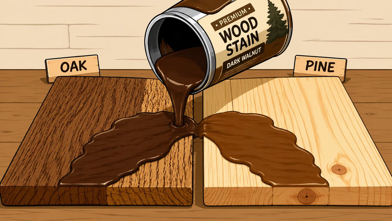
Oak, maple, cherry, and other furniture woods don't absorb stain the same way. Grain pattern, density, and natural color all change the outcome. That's why a medium brown shown online can read lively and textured on one table, then smoother and quieter on another.
Independent finishing research noted in the FinishWorks stain chart guide shows that a single stain formula can create up to a 15 to 20% color difference in lightness and red-green coordinates when applied to oak versus maple under standardized lighting. In plain language, the same stain can look noticeably different just because the wood changed.
A quick comparison helps:
- Oak tends to show more grain movement and often gives stain a stronger, more textured look.
- Maple is usually smoother and can look more even and restrained with the same finish.
- Cherry starts with its own warmth, so many stains build on that warmth rather than erase it.
That's why shoppers comparing hardwoods often benefit from a primer like BILTRITE's guide to choosing the right hardwood for longevity and style.
Why showroom samples matter
A printed swatch can't show absorption. A phone screen can't show pore structure. And a stain name can't reveal how boldly grain will stand out across a tabletop.
That's where people often get tripped up. They assume the finish they admired on a broad-plank oak table will look identical on a cleaner-grained maple dresser. It won't. It may still look beautiful, but it won't look identical.
Practical rule: never approve a stain based only on color name. Approve it on the actual wood species, or at least on a sample of the same species.
One more detail matters here. Some woods naturally pull warm notes forward. Red oak, for example, often looks appealing with deeper brown stains, while stains with stronger yellow or red undertones can bring out pink notes that some homeowners would rather soften. That's one reason species-specific samples make the decision clearer.
A family choosing solid-wood furniture isn't just choosing a color. They're choosing how grain, tone, and texture will work together every day in the room.
Matching a Stain to Your Homes Style
The right finish rarely comes from picking a favorite sample in isolation. It comes from seeing the whole room and making the furniture belong there.

Style first, stain second
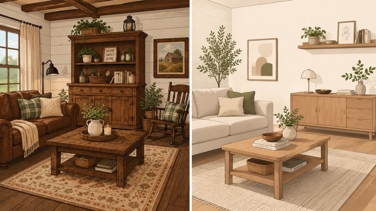
A farmhouse room, a mid-century room, and a formal traditional room can all use brown wood, but they usually need different browns. Style gives the stain direction.
A few examples make that easier to picture:
- Farmhouse and casual rustic spaces often lean into medium warm browns, weathered effects, or softer earthy finishes that don't feel too polished.
- Mid-century inspired rooms usually look strong with walnut-like warmth, cleaner grain presentation, or natural finishes that keep lines crisp.
- Contemporary and transitional homes often handle gray-leaning neutrals, deep espresso-like tones, or near-black accents especially well.
- Classic traditional rooms usually welcome richer browns that add depth and make the room feel settled.
Shoppers comparing broad home looks can get useful visual language from BILTRITE's overview of types of furniture styles.
Undertones decide whether a room feels calm or off
Many stain mistakes aren't about darkness. They're about undertones. A floor may look brown at first glance, but its undertone might lean golden, red, gray, or neutral. A new table with the wrong undertone can feel out of place even when the color depth seems close.
That problem shows up often in open layouts. Existing guidance on wood stain color options rarely addresses multi-room coordination well, and independent interior design research summarized in Benjamin Moore's stain advice page notes that homeowners increasingly struggle with undertone dissonance when mixing wood tones in open-plan homes.
A simple matching method works better than trying to force exact sameness:
| Existing feature | What to look for in a new stain |
|---|---|
| Warm hardwood floor | a stain with related warmth, not a cool gray-brown |
| Gray tile or cooler wall palette | a neutral or slightly cooler brown |
| Busy grain in nearby cabinetry | a calmer stain that doesn't compete too hard |
| Mixed woods in connected rooms | a bridge tone that relates to both, often medium-depth and balanced |
A room usually looks more comfortable when wood finishes coordinate by temperature and mood, not by exact shade.
Lighting finishes the job. Morning light, recessed kitchen lighting, shaded family rooms, and warm evening lamps all change what the stain shows. That's why a dark finish that looks perfect in a bright showroom can feel heavier at home, while a pale finish that looked understated in-store can look washed out beside strong sunlight.
Homes don't get furnished one sample card at a time. They get furnished one relationship at a time. Furniture to floor. Table to cabinet. Bed to wall color. That's how the room starts to feel pulled together.
The Secret to Success See It Before You Commit
The safest stain decision is a tested stain decision. That's not glamorous advice, but it saves a lot of regret.

A better testing routine
People often compare colors too quickly. They look at a chip, pick the one that seems closest to a saved photo, and hope the final piece lands the same way. A more reliable routine is simple:
- Narrow the field first. Pick a small group from one color family, not a random mix of light, medium, dark, and gray.
- View the stain on real wood. The test sample should match the furniture species whenever possible.
- Take the sample into the actual room. Morning, afternoon, and evening light can all shift the look.
- Set it next to fixed surfaces. Flooring, trim, paint, cabinetry, and nearby furniture matter more than the sample card itself.
- Live with it briefly. A stain that feels exciting for thirty seconds may feel too red, too dark, or too cool after a day of honest viewing.
Readers who have wrestled with online color disappointment may also appreciate BILTRITE's article on how to avoid color mismatch when ordering online.
When darker stains solve a design problem
Some rooms include more than one wood species. A table may be one species, nearby cabinetry another, and trim something else altogether. That mix can exaggerate differences in porosity and natural color.
The Rubio Monocoat stain guide notes that when multiple wood species are used in one project, darker stains often help mask those variations because they cover substrate differences more effectively than light or medium tones. That's a practical design tool, not a rule that everyone must go dark.
Sometimes the smartest choice isn't the light stain a homeowner originally pinned online. Sometimes it's a richer medium-dark finish that calms a mixed-wood room and helps separate pieces feel more related.
Sample boards settle arguments quickly. A stain either works with the room, or it doesn't.
That's why finish selection should happen with the eyes, not guesses.
Bring Your Vision to Life at BILTRITE
Custom finish shopping works best when inspiration photos, wood samples, room details, and real conversation all meet in one place. That's the bridge many homeowners need. Online images can help identify a mood, but they can't replace side-by-side comparison on actual furniture woods.
Why local showrooms still matter
The wood stain business has grown along with demand for more customized finishes. In the United States, wood stain product sales reached about US$2.3 billion in 2023 and are projected to grow at about 7.5% CAGR to an estimated US$4.9 billion by 2034, according to Fact.MR's U.S. wood stain industry analysis. That growth reflects how much finish choice now matters in home design.
More options are helpful, but they also create decision fatigue. A local showroom brings those options back down to human scale. Instead of scrolling through endless inspiration, customers can compare actual woods, discuss room lighting, and sort out whether a finish needs more warmth, more depth, or less red.
For homeowners exploring custom orders, BILTRITE Furniture-Leather-Mattresses offers a showroom-based process where shoppers can review choices in wood, finish, and other details in person. The store doesn't sell online, so the focus stays on face-to-face guidance and sample-driven decisions.
Custom furniture gets easier with a real conversation
That in-person process matters most with Amish-made and USA-made furniture because the finish is part of what makes the piece feel personal. A dining set for a bright open kitchen may call for one direction. A bedroom suite in a cozier space may need something quieter and deeper.
The Greenfield showroom gives Metro Milwaukee shoppers a place to bring fabric ideas, flooring photos, cabinet references, and finish questions without pressure. BILTRITE has served the area since 1928 as a fourth-generation family-owned business, with a team that brings more than 400 years of combined experience. The store also carries something for a wide range of homes, from small-scale options for tighter spaces to heavy-duty furniture for active family life, plus a mattress department with over 60 models.
Customers who are just starting the process can also review BILTRITE's guide to getting started with a custom order.
A stain choice shouldn't feel like a guessing game. It should feel like the moment a good piece of furniture starts to look like it belongs in the family's home.
Ready to explore wood stain color options on real wood instead of a screen? Visit BILTRITE Furniture-Leather-Mattresses in Greenfield, bring a few room photos, and chat with the team about Amish-made, USA-made, and solid-wood furniture finishes that fit the way a home looks and lives.