3 DAY MATTRESS SALE! THURSDAY - FRIDAY - SATURDAY!
LABOR DAY SALE HELD OVER ENDS SATURDAY, SEPTEMBER 19 AT 5PM!
NO CREDIT CARD FEES!
1000's of Items IN-STOCK + 500 Mattresses!
Largest selection of USA Made Furniture & Mattresses + Amish Made!
FREE In-Store Design Services!
BUY LOCAL & LOVE YOUR HOME!
3 DAY MATTRESS SALE! THURSDAY - FRIDAY - SATURDAY!
LABOR DAY SALE HELD OVER ENDS SATURDAY, SEPTEMBER 19 AT 5PM!
NO CREDIT CARD FEES!
1000's of Items IN-STOCK + 500 Mattresses!
Largest selection of USA Made Furniture & Mattresses + Amish Made!
FREE In-Store Design Services!
BUY LOCAL & LOVE YOUR HOME!
OPEN LABOR DAY | Tuesday-Thursday 10am to 6pm | Friday 10am to 7pm | Saturday 10am to 5pm | Sunday Closed To Be With Family & Friends | Monday Showroom Closed
5430 West Layton Ave, Greenfield - Metro Milwaukee
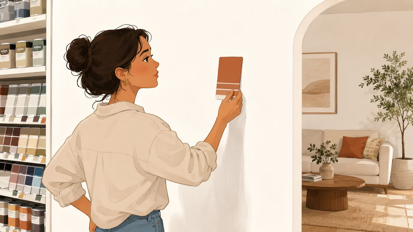
You're standing in a showroom, holding a paint chip in one hand and trying to imagine it next to a real oak table or a brown leather sofa. That's the whole game with a warm earthy color palette. It's not really about the wall, it's about whether the room feels calm, grounded, and lived in once the wood grain, leather, fabric, and light all show up together.
For a furniture family like ours at BILTRITE, that matters. Warm earthy colors have real staying power because they're tied to natural pigments and a long design tradition that keeps coming back when people want homes that feel authentic and comfortable, not shiny or synthetic. The result is a palette that works beautifully with solid wood and leather, but only if it's built with intention.
Why Warm Earthy Colors Feel Like Home
A homeowner can stand in a showroom for ten minutes, hold up a terracotta chip, and still feel unsure. That hesitation makes sense. A warm earthy color palette does its best work when it stops looking like a sample and starts looking like a room full of real materials, wood, leather, linen, and stoneware all pulling in the same direction.
Why the feeling is so familiar
Warm earthy colors have deep roots in human making. Artists were creating pigments from soil, animal fat, burnt charcoal, and chalk as early as 40,000 years ago, and that early palette centered on five core colors, red, yellow, brown, black, and white. Later, the modern warm-earth look picked up strong cultural momentum in the 1970s, when earth tones became closely associated with the environmental movement after Earth Day on April 22, 1970. Those older design echoes still matter because people keep reaching for colors that feel grounded, not brittle or high-strung. A brief history of color in art
That history explains why warm earthy rooms feel honest. They don't need to shout. They sit beside oak, walnut, brown leather, woven baskets, and brushed metal, which is why they feel so natural in living rooms, bedrooms, and dining spaces where people spend time.
Practical rule: if a color looks good only on a screen, it's not ready for a furniture purchase.
For readers who like a more personal design lens, this home-comfort piece from our own site fits the same idea, a room should feel like a place people can settle into, not just look at from across the room.
The strength of warm earthy color is that it behaves like furniture, not decoration. It supports daily life. A walnut table feels sturdier under a rust-toned wall, a leather chair looks richer beside clay or sand, and woven texture keeps the whole room from turning stiff. That's why this palette has outlasted trend cycles so reliably.
The Color Families That Make Up a Warm Earthy Palette
A lot of people say “earth tones” and mean almost anything muted. That's too sloppy for a furniture decision. Warm earthy colors are a specific family, and the red-, orange-, and yellow-leaning side is what belongs in this conversation, not cooler tones like sage, olive, charcoal, taupe, or greige. Warm earthy color families
The names shoppers should actually use
These are the names that matter when comparing upholstery, rugs, and finish samples in a showroom. Interior guidance groups the warm side into terracotta, rust, cognac, ochre, mustard, camel, burnt orange, dusty pink, oxblood, and brick. That vocabulary helps people stop guessing and start choosing.
Here's a simple swatch sheet to bring to the store.
Family
Hex Code
Pairs Well With
Terracotta
#C65A3A
Oak, cognac leather, cream linen
Rust
#B55239
Walnut, stoneware, aged brass
Cognac
#8A4B2A
Chocolate brown, camel, natural oak
Ochre
#C58B2C
Warm white, woven texture, matte black
Mustard
#B48A1C
Dark wood, leather, cream upholstery
Camel
#C19A6B
Walnut, taupe, linen
Burnt Orange
#C45A2A
Oak, rust, textured neutral rugs
Dusty Pink
#C58C82
Walnut, cream, brushed metal
Oxblood
#5A1F20
Light cream, tan leather, dark wood
Brick
#8C3F2B
Oak, stone, wool throws
What to buy first
Start with the piece that stays put the longest. In most homes, that's a sofa, dining table, dresser, or leather chair. Then compare the surrounding tones to that anchor instead of trying to force a wall color to do all the work. That's where a quick in-store comparison helps, and it's why our color-palette guide belongs in the conversation.
The best warm earthy rooms don't use every family at once. They pick one direction, then repeat it with discipline. Terracotta, cognac, and rust read energetic. Camel, ochre, and brick read steadier. The trick is matching the mood to the furniture, not the other way around.
Building Your Palette Using the 60-30-10 Rule
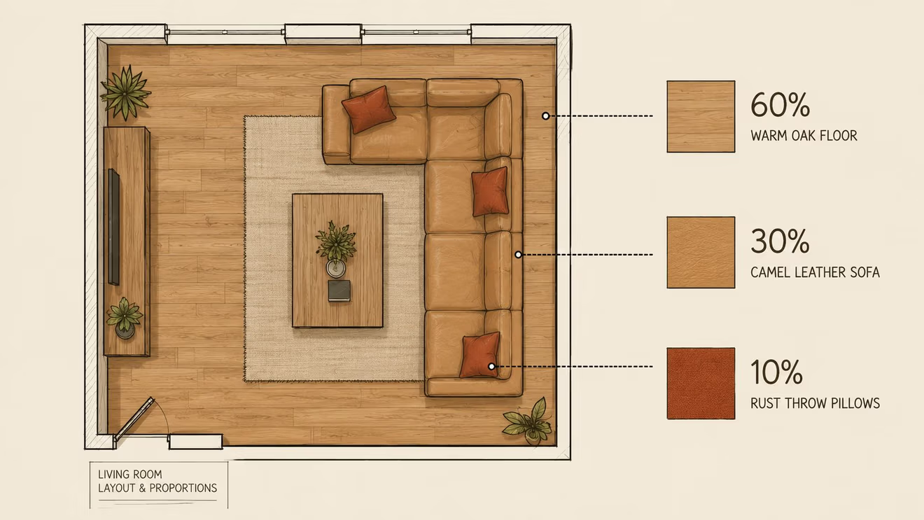
A warm palette falls apart when every piece tries to be the star. That's why the old 60-30-10 rule still works, especially when furniture is the starting point. A room needs one anchor, one supporting group, and one small relief note, or the eye has nowhere to rest.
A furniture-first way to split the room
Treat the 60% as the biggest visual field in the room. In a dining area, that might be a solid wood dining table and hutch in oak or walnut. In a living room, it might be a sofa in a grounded neutral or a dominant wood finish on the main case pieces. The point is simple, one major tone needs to carry the room.
The 30% should support that anchor without fighting it. Think leather chairs, a complementary loveseat, a sideboard, or a pair of accent tables with a similar depth of color but a different texture. Warm earthy palettes start to feel layered instead of flat.
Good balance feels quieter than people expect. If the room looks exciting in the sample stage but exhausting in real life, the mix is probably too busy.
The final 10% is for release. That can be a pillow, a stoneware lamp, a clay vase, or a small patterned throw. It should never be the loudest object in the room. It should keep the palette from turning monolithic.
For shoppers comparing finishes in person, our accent-wall color advice is useful because the same balancing logic applies to a room full of wood and upholstery. The anchor comes first, then the supporting tones, then the accent.
The smartest move is to assign the percentages before buying anything decorative. Once the big furniture pieces are set, the palette becomes far easier to control. That's how a room stays intentional instead of becoming a pile of good-looking samples that never quite settle.
Keeping Earth Tones From Going Flat or Muddy
Earth tones live in muted territory, and that's both their strength and their trap. A more technical color framework places most earth tones around 15% to 45% saturation, which is exactly why they feel natural, but also why they can look dull if every piece sits at nearly the same value. Earthy color palette guide
What muddy actually means
A room gets muddy when the eye can't tell one surface from the next. Medium-brown upholstery against a medium-brown rug against a medium-brown wall is the classic mistake. The pieces may each be attractive alone, but together they collapse into one soft blur.
The fix is value separation. Put something light next to something deep. A cream throw on a chocolate sofa works. A dark walnut side table beside a tan chair works. A pale rug under a rust chair works. What doesn't work is three middle values stacked in a row and hoping texture will save it.
Contrast is doing more work than color in most earthy rooms.
Lighting matters too. Low-light rooms and north-facing rooms are the first places earthy palettes go stale. They need either a very light cream to lift the room or a very dark brown to ground it, otherwise everything hovers in the same middle zone and the room feels tired.
A quick check helps. Step back and squint at the room or at the samples together. If each piece melts into the next, the contrast is too low. If one item feels sharp enough to stand apart, the room probably has the structure it needs.
For more on making patterns and tones work without visual mush, this mixing guide is worth a look. The same rule applies here, not everything should match, and not everything should compete.
The safest earthy rooms use muted color, not weak color. Muted doesn't mean bland. It means controlled. That control is what keeps the palette calm without making it sleepy.
Room by Room Pairings for a Cohesive Home
A warm earthy palette should change a little from room to room, because every space asks for a different job. A dining room can handle more richness. A bedroom usually wants less contrast. A small apartment needs tighter edits. The palette stays the same, but the furniture mix should flex.
Living room, bedroom, dining room, and smaller spaces
In the living room, a leather sofa in cognac or camel usually makes the strongest anchor. Add a walnut coffee table, a rust or clay pillow, and a woven rug that doesn't try to outshine the seating. That combination feels settled fast, which is why earthy palettes work so well for family rooms.
In the bedroom, keep the wood a little softer and the fabrics a little calmer. A warm walnut bed, cream bedding, and a dusty pink or muted ochre throw are enough. The bedroom should feel restful, not styled for a magazine cover that nobody can sleep in.
The dining room can take the richest treatment. An Amish-made solid oak dining set with cognac leather chairs and a rust area rug gives the room depth without making it heavy. If the room has a sideboard or hutch, let that wood finish echo the table rather than introducing a second competing species of wood.
For smaller homes, apartments, or senior living layouts, scale matters just as much as color. A camel sleeper sofa, a warm walnut accent table, and one lighter textured chair will read generous without crowding the room. This is also where BILTRITE's small-scale furniture and come-apart seating can make a practical difference, because the right size piece helps the palette breathe.
Wood grain looks different in person than on a card, and leather hides never photograph exactly like they feel in the room.
That's why the showroom matters here. A chair that looks golden online may read deeper in daylight, and a rug that seems quiet on screen may feel much richer in real life. The room works when the tones are judged together, not in isolation.
Lighting and Accessories That Bring the Palette to Life
The right light can rescue a warm earthy room. The wrong light can make it look flat, brown, and a little sad. Warm bulbs in the 2700K to 3000K range help earthy colors glow, while cooler light tends to push them toward gray or dullness. Warm earthy interior paint colors
What changes at different times of day
Morning light is honest. It shows whether a camel chair really is camel or whether it drifts too close to tan. Evening lamp light is kinder, and that's exactly why a layered lighting plan matters. Overhead lighting, task lighting, and a small accent lamp each do a different job, and earthy rooms need all three if they're going to feel finished after sunset.
Texture does the rest. Nubby linen keeps a leather sofa from feeling too formal. Rough stoneware makes a smooth walnut table feel warmer. Woven rattan and chunky wool throws add friction in the best way, which keeps the room from turning into one long brown note.
A warm room needs contrast in texture even when the color family stays close.
Accessories should finish the palette, not rewrite it. Swap bright chrome hardware for aged brass if the room wants more warmth. Put a hand-thrown clay vase on a side table. Add a wool throw that carries one of the room's deeper tones. Those are small moves, but they matter.
For shoppers thinking about how the room lights up across the day, this lighting guide from our site is a practical companion. It fits especially well with earthy furniture because the materials respond so differently to daylight and evening lamps.
A good earthy room should look comfortable at breakfast and even better at night. If it only works when the curtains are open wide, the palette still needs help.
Putting It All Together with a Quick Checklist
A warm earthy room doesn't happen by accident. It starts with the anchor piece, then gets shaped by value, texture, and light. If a homeowner keeps that order straight, the room stays grounded instead of muddy.
Here's the short version to keep on hand:
Choose the anchor first. A sofa, table, bed, or leather chair should set the direction.
Assign the 60-30-10 balance. Let the biggest piece carry the room, support it with a second tone, and use one small accent for relief.
Check contrast. Don't stack medium color on medium color and expect it to read clearly.
Test in real light. Daylight and lamp light can change everything.
Bring samples to the showroom. Real wood grain and real leather tell the truth.
BILTRITE's Greenfield showroom gives shoppers a place to compare furniture, finishes, and fabrics side by side with help from a team that knows how these combinations behave in actual homes. That kind of in-person comparison is the smartest way to build a palette that feels warm, not muddy.
Ready to bring your warm earthy color palette to life with real wood, leather, and fabric choices? Visit BILTRITE Furniture-Leather-Mattresses in Greenfield and see how the finishes look in person. Our team can help match the right pieces to your home, and we'd love to help you build a room that feels comfortable from the first day.